
Three image workflows for a Swiss university hospital, including one new brand-distinctive style built from the ground up. Delivered as a prompt generator and style guide the in-house brand team could use independently.
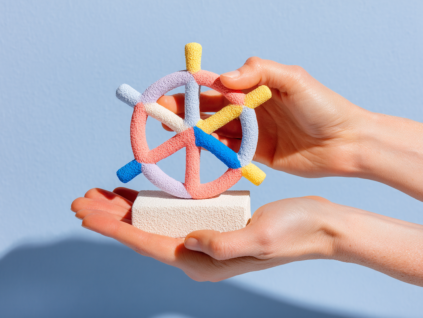

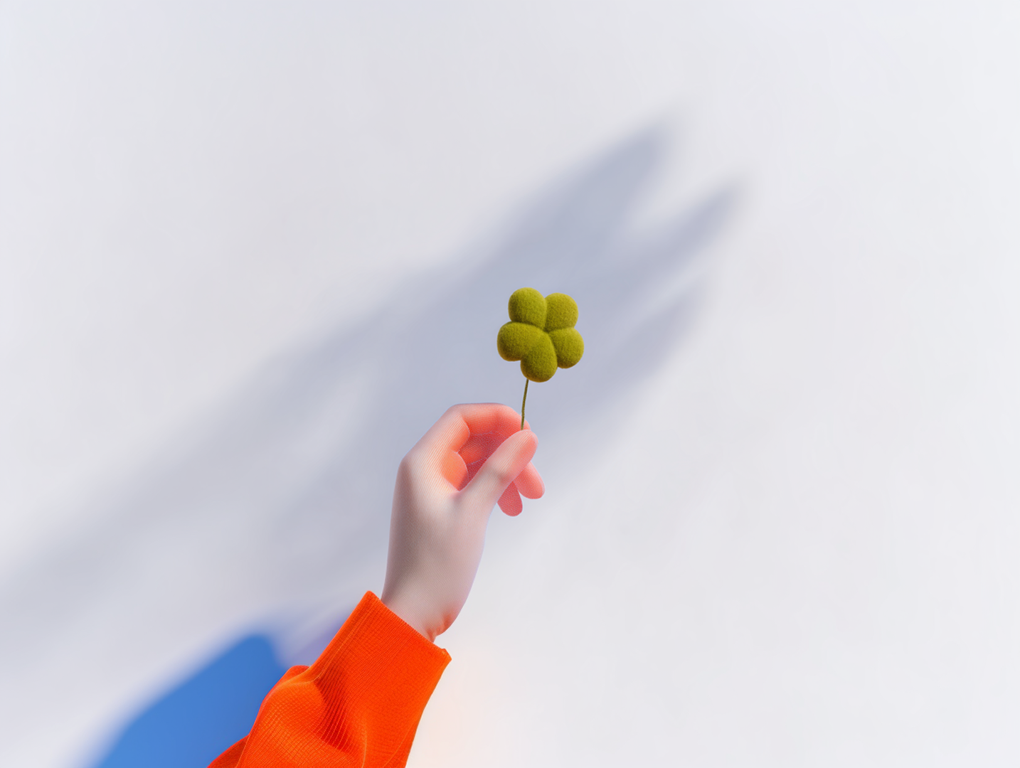
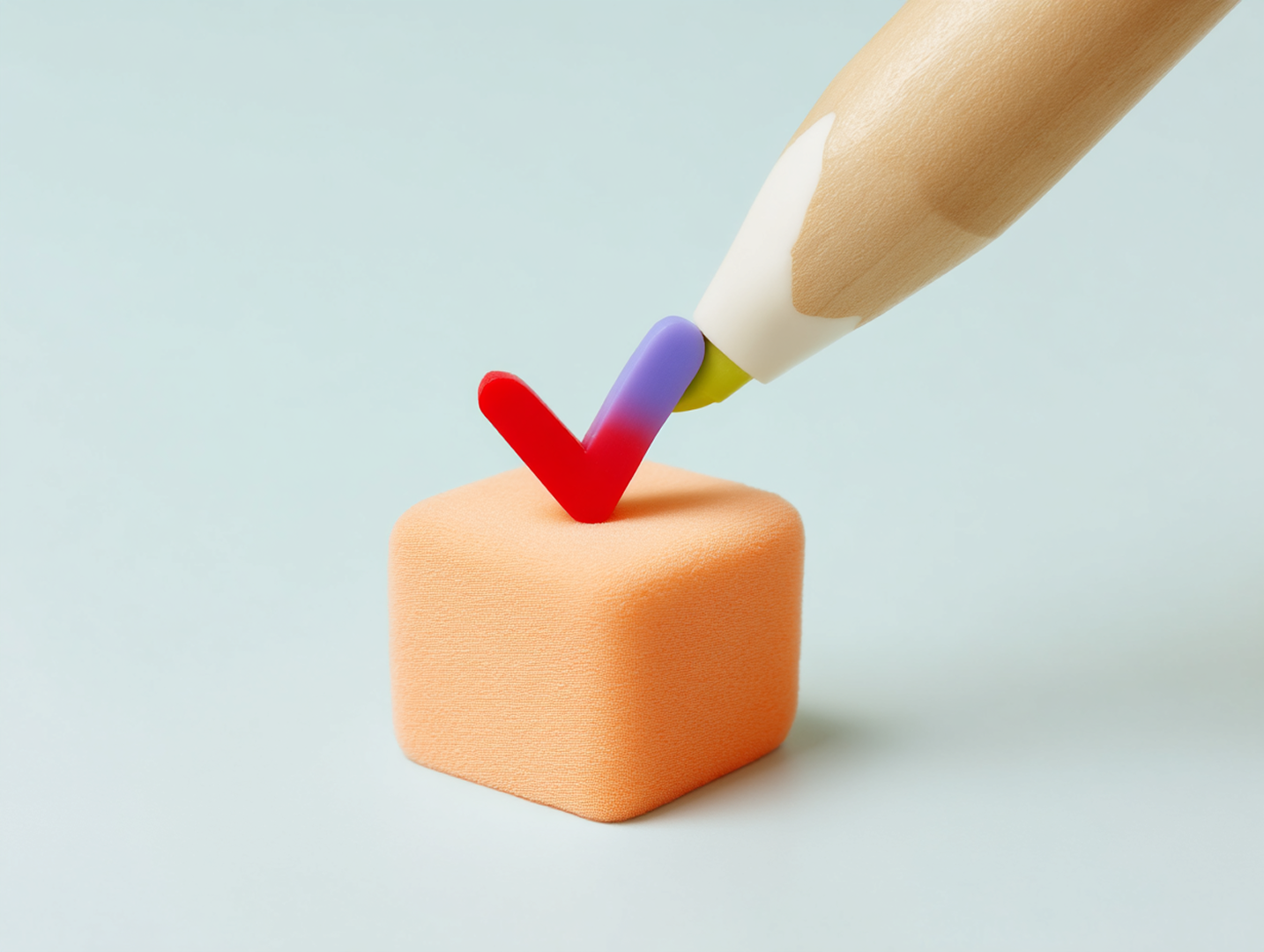
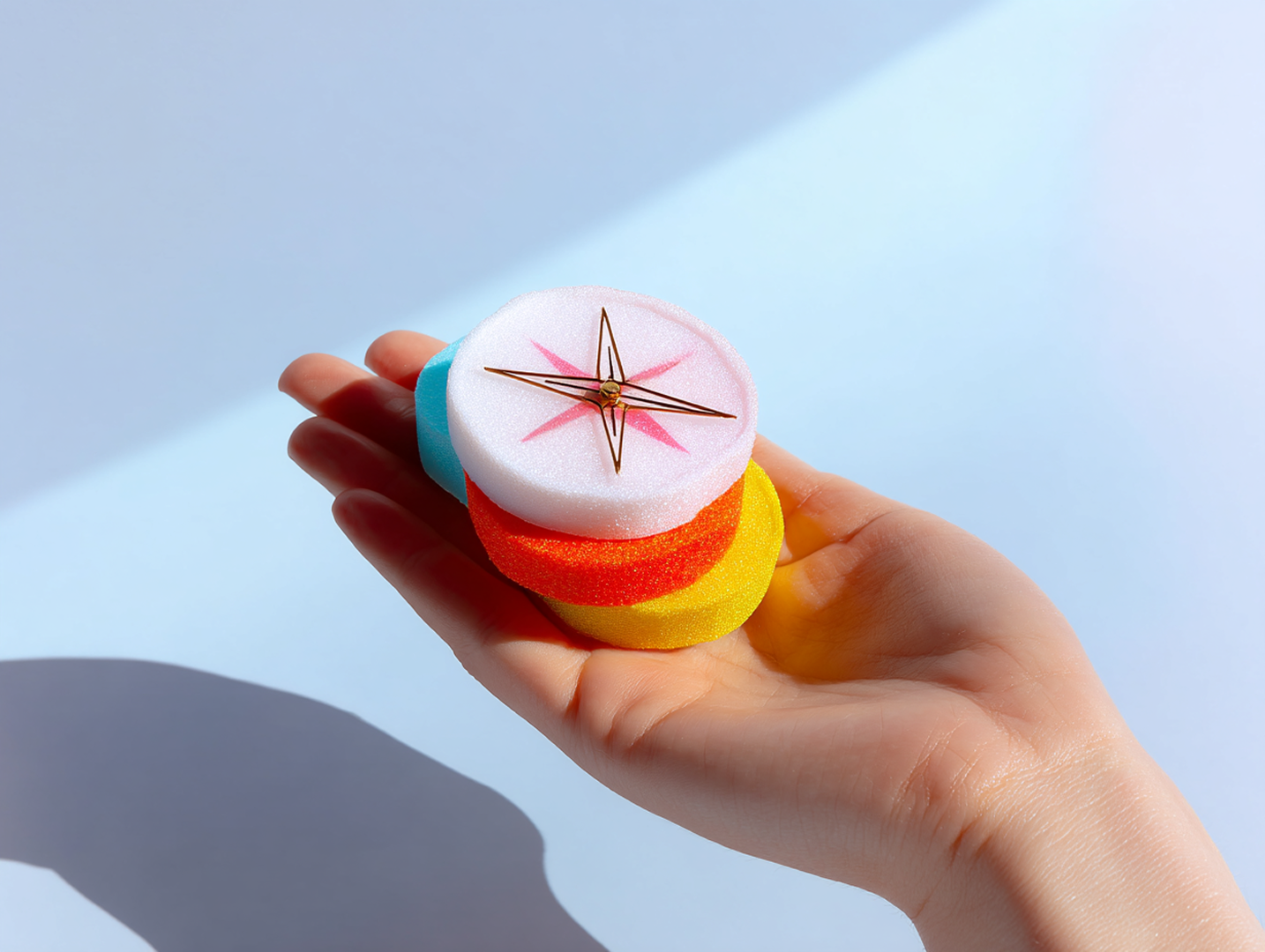
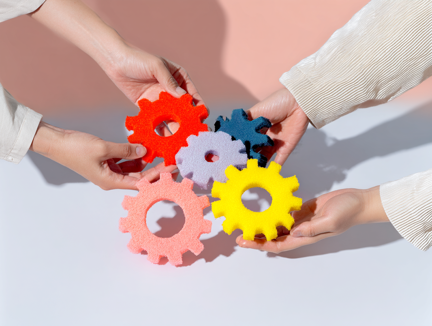
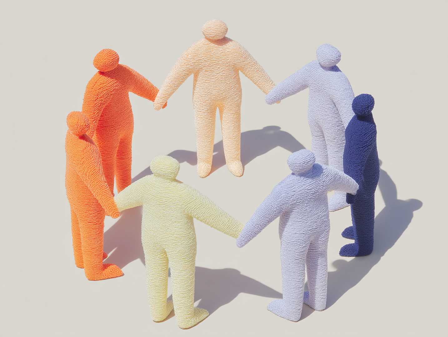
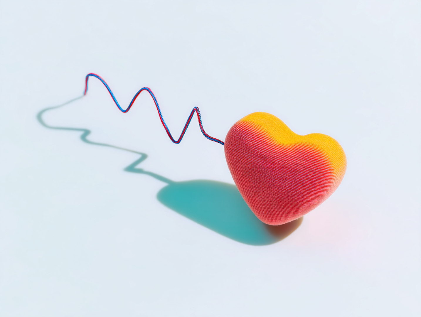
Universitätsspital Basel had two existing image styles, both working well. What they didn't have was a brand-owned answer to the territory most often filled by stock: leadership, teamwork, guidance, direction. The kind of generic metaphor imagery any hospital, any insurer, any healthcare brand could buy from the same library.
The brief was to build a third style. Something brand-distinctive enough to replace stock entirely, while still working as fast as licensing a Shutterstock image.
The new imagery had to carry the same metaphors (leadership, teamwork, guidance) but in a visual language only USB could use. Soft fabric textures, pastel tones, structures you could feel. The colour palette came from the existing brand identity. The rest had to be invented.
The deliverable wasn't a folder of images. It was a system the in-house brand team could run without an AI specialist on call. In 2024, when prompt-based imagery was still hard to make consistent, that meant building a prompt generator and a style guide that did the heavy lifting.
The new style was built from the brand's existing colour palette outward. Soft pastel tones, fabric and knit textures, structures you could feel, every image carrying the care the brand is built on. The system itself was three parts: a prompt generator that turned plain-language briefs into working prompts, a Midjourney style reference that locked the look, and a knowledge transfer so the brand team could run the system independently.
A third image style now sits alongside the two that already worked. Same speed as stock. Nothing exchangeable about it.
For people in motion, ready to test, willing to discard.
Tell me what you're working on →